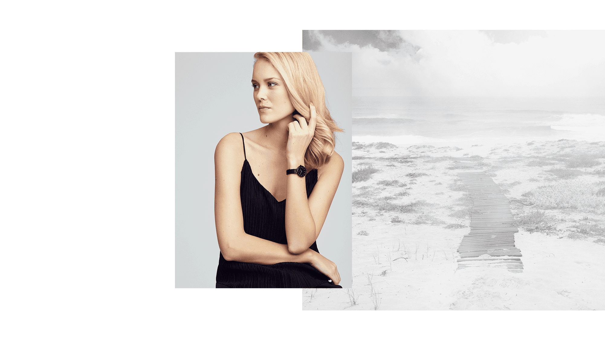
Mockberg is a Swedish watch company founded in 2013 by Elvira Eriksson and her brothers Daniel and Kristoffer. The company aimed to fill a gap in the market for minimalist and feminine wristwatches. The name Mockberg comes from a mountain in Dalarna and the brand is known for its Scandinavian design featuring simplistic, minimalist, and functional watches. Today, Mockberg has a strong global presence in both retail and e-commerce.
Strategy
Strategy
UX/UI
UX/UI
Visual design
Visual design
Mockberg
Mockberg
Mockberg
Mockberg
My main responsibilities
2018
2018
Background
Since its founding, Mockberg has expanded from the Swedish market to global sales, driven by its e-commerce presence. Targeting fashion-conscious young women who are tech-savvy and trend-sensitive, mobile traffic makes up 67% of their website visits. This aligns with the global trend of increased mobile e-commerce, necessitating a cutting-edge mobile shopping experience.
Process
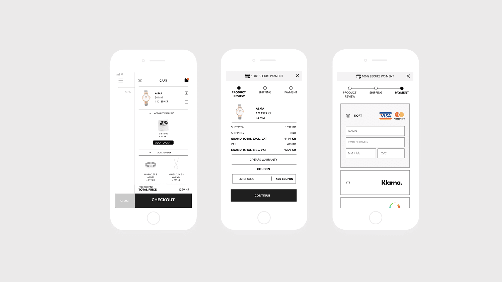
To enhance Mockberg's mobile shopping, we focused on creating a seamless user experience that is exclusive, modern, and inspiring. Research on competitors, mobile e-commerce trends, and UX, as well as an analysis of the current website, identified three key factors for improvement: intuitive navigation, inspiring product displays, and a clear checkout process. Wireframes and mood boards were developed, leading to a detailed mobile website prototype.
Redesign:
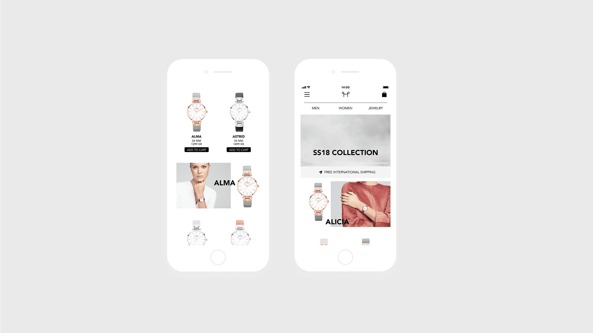
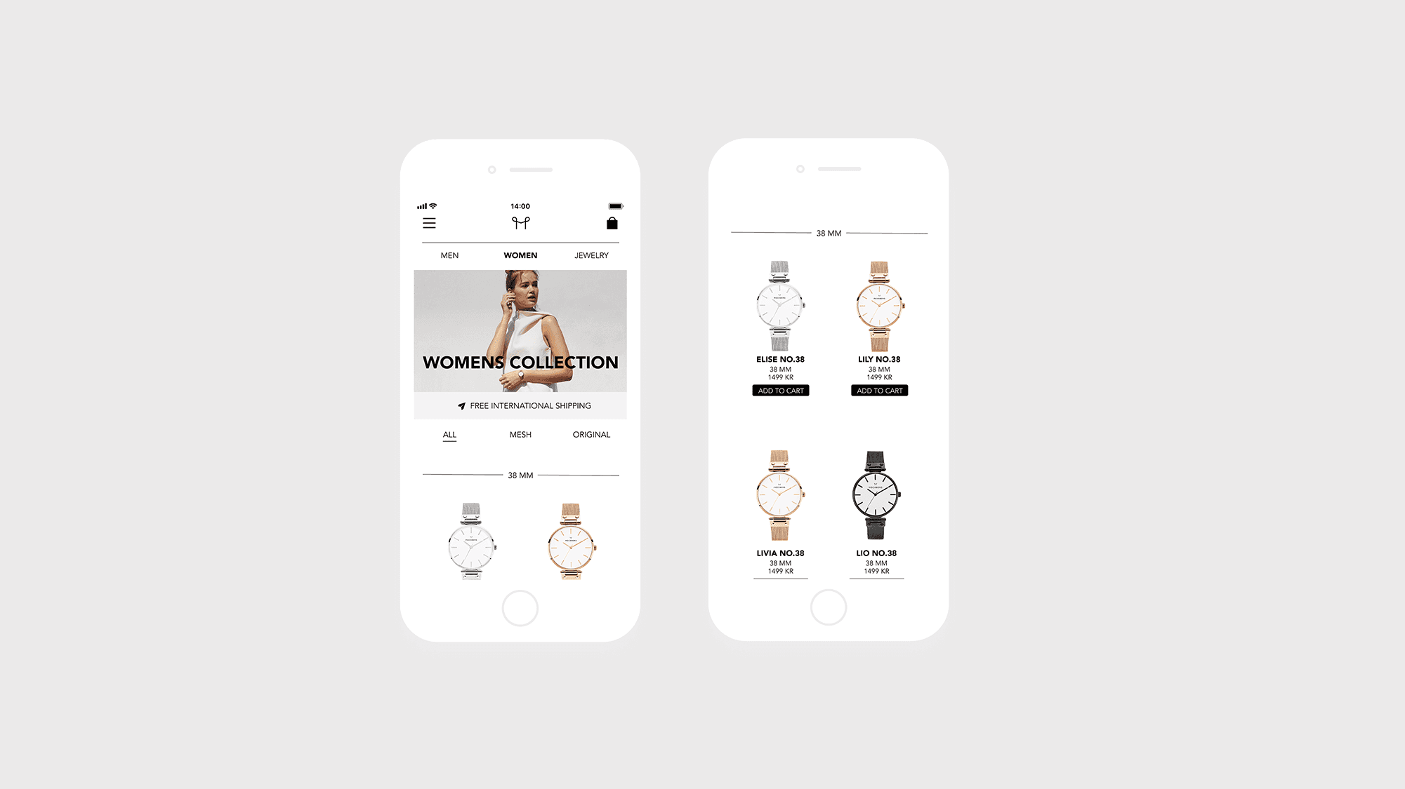
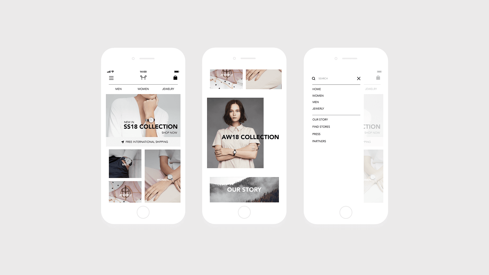
We designed a clean, inspiring homepage to facilitate navigation and reflect Mockberg's feminine and exclusive Scandinavian design. Collection and category pages were crafted to inspire visitors and showcase the product range, alternating between products and inspirational images. Clear information and call-to-action buttons were provided.
Summary
Our redesign aims to create a narrative around Mockberg and the experience of owning a Mockberg watch. By simplifying navigation and the checkout process, we aim to enhance the customer experience. This mobile website transformation is expected to attract more customers, increase conversions, and align with global e-commerce trends.
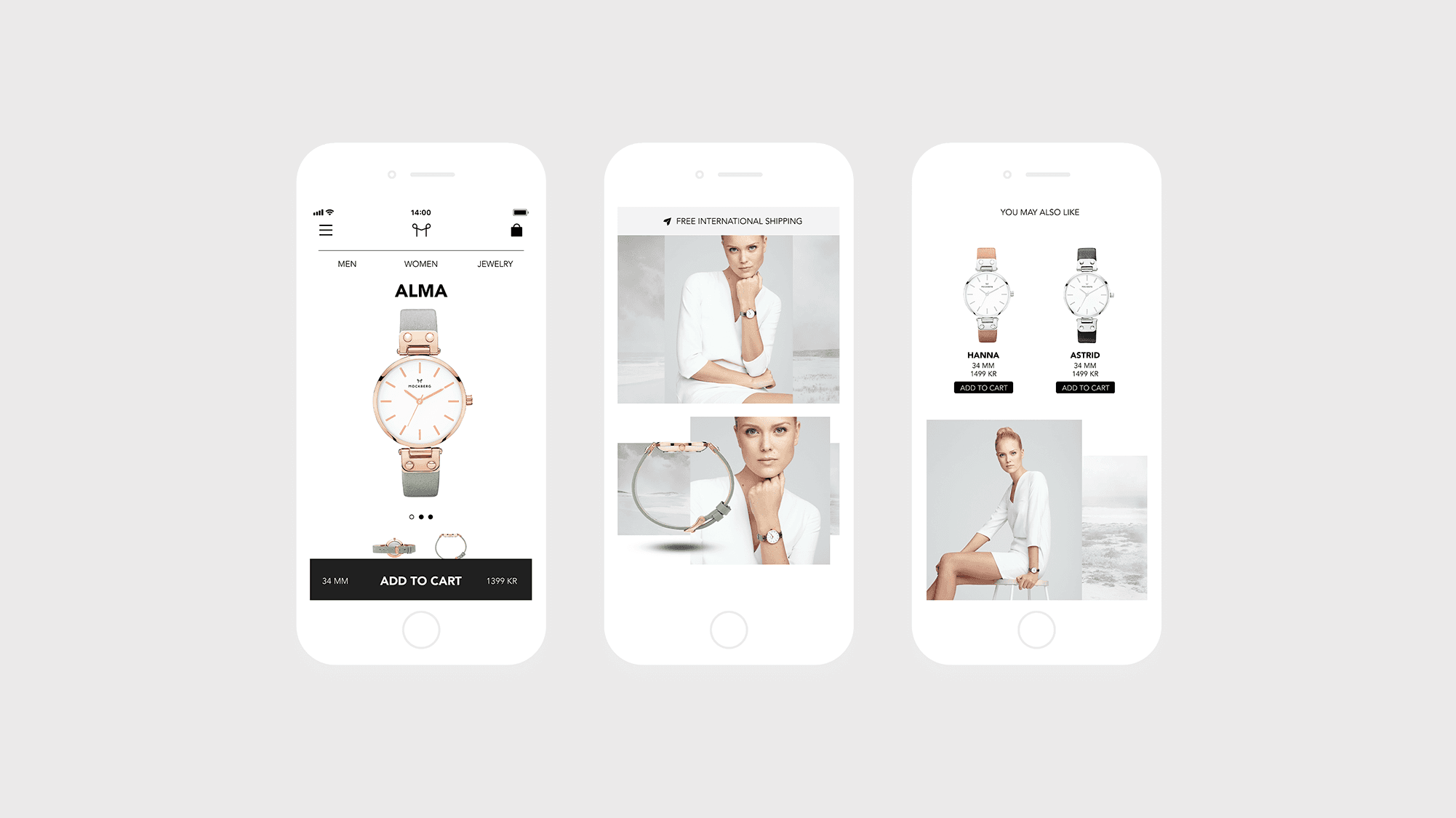
Main categories were easily accessible from the top menu, with secondary navigation in a hamburger menu. Product pages featured large, easily scrollable images, detailed information, and studio photos. Recommended products and links to other pages offered a personal feel and seamless navigation. A fixed menu bar at the bottom displayed product price, size, and a call-to-action button.